 AfterACTION
AfterACTION
A one-person DVA guide, shipped over four months.
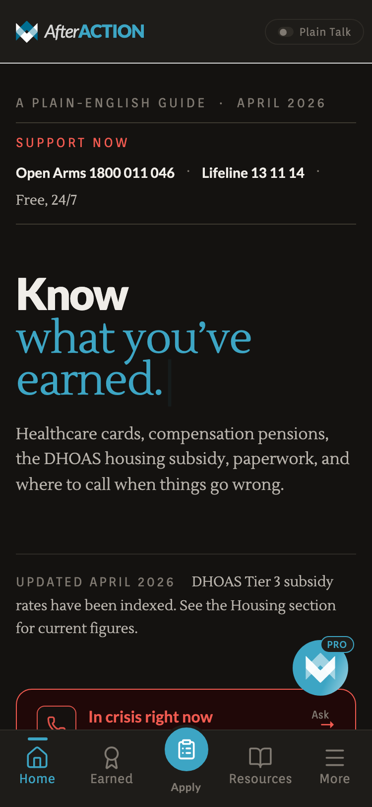
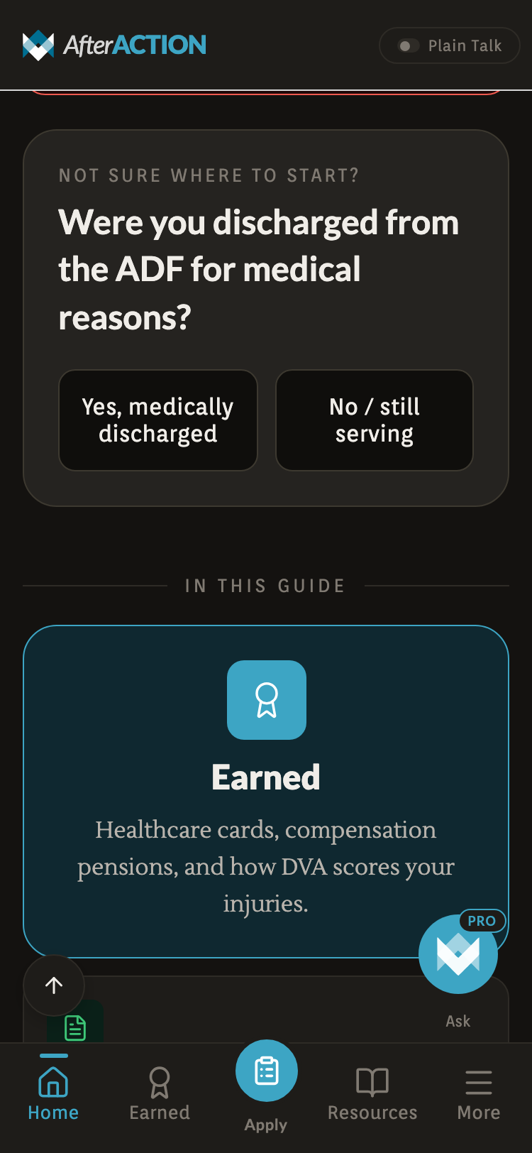
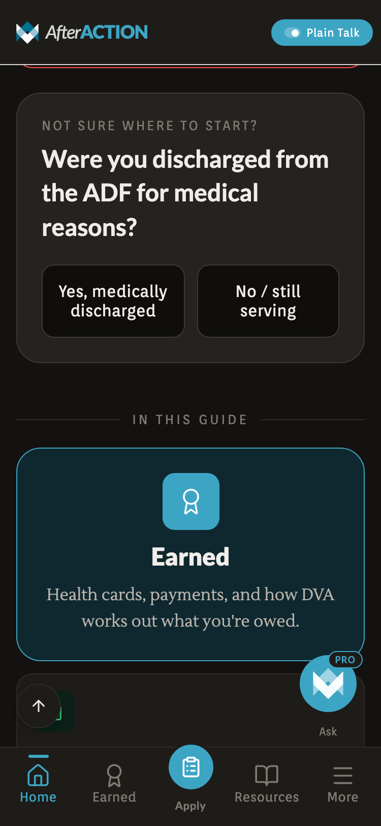
After Action is a mobile and web app that translates the Department of Veterans’ Affairs into plain English. Veterans land on Home, get the Crisis tile, ten topic tiles for needs-based triage, and a seven-step guide for the Gold Card path. Static TypeScript data, no backend, no accounts. Designed and built by an Australian veteran over four months.
DVA’s site is exhaustive and incomprehensible.
A veteran who needs to know whether they qualify for a Gold Card, find a counselling number tonight, or work out what a TPI claim actually involves has to wade through a bureaucratic portal that assumes they already know the acronyms.
The veterans who most need this information (older, in pain, mid-crisis, or just discharged) drop out before they find what they’re entitled to. The system rewards persistence, which is exactly what the population doesn’t have.
Three rules that drove every screen.
- i
Plain English, always.
If a sentence needs a glossary, rewrite the sentence. Year 10 reading level throughout. Not a constraint: the goal.
- ii
Crisis is one tap from anywhere.
A vet in distress doesn’t navigate menus. The Crisis row is the first interactive element on Home, the first row of Quick Finder. One tap to a screen of phone numbers.
- iii
Curated beats clever.
No AI free-text search on the front door. A grid of ten topic tiles with hand-written content. Predictability outranks flexibility when the user is anxious, exhausted, or new to the system.
Editorial hero + Crisis tile pinned high
10 topic tiles · needs-based triage
One-tap hotlines, no menu dive
Hotlines + entitlements + links
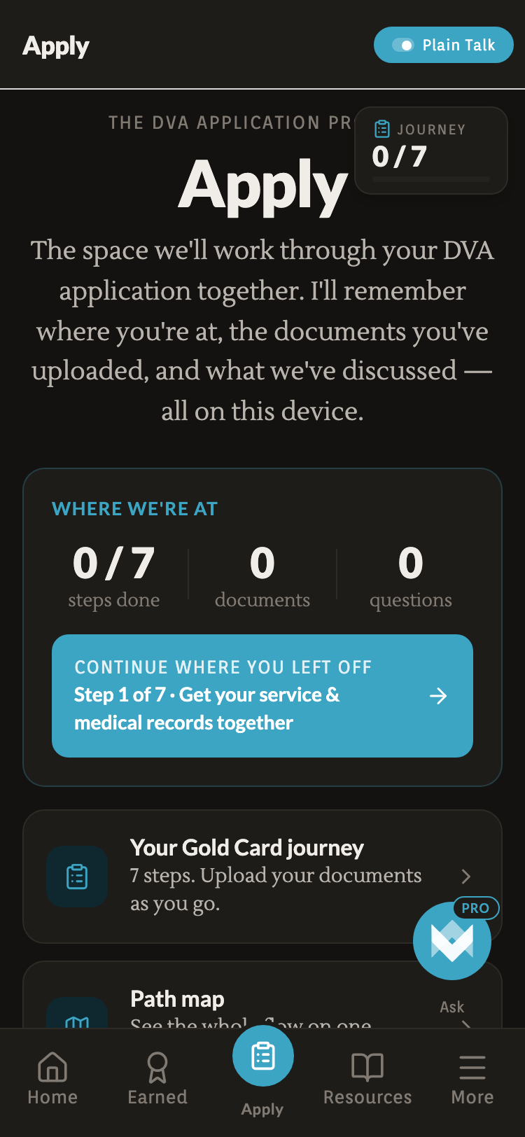
7-step Gold Card Journey + documents
Gold / White / Orange card hub
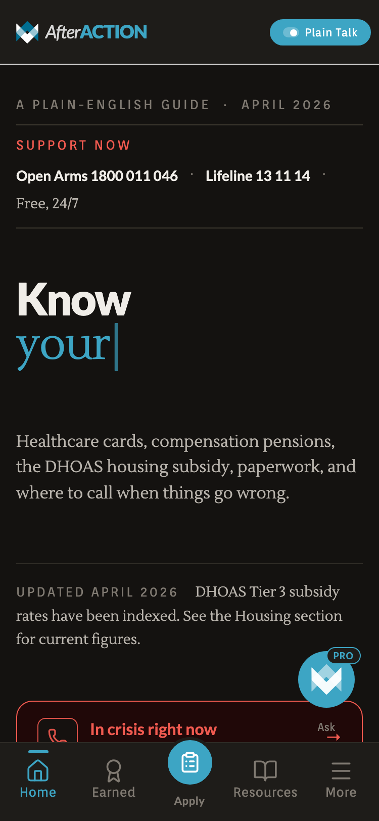
The Plain Talk toggle lives in the header. Flick it on and DVA names get rewritten as plain English everywhere the veteran reads. State persists across the app.
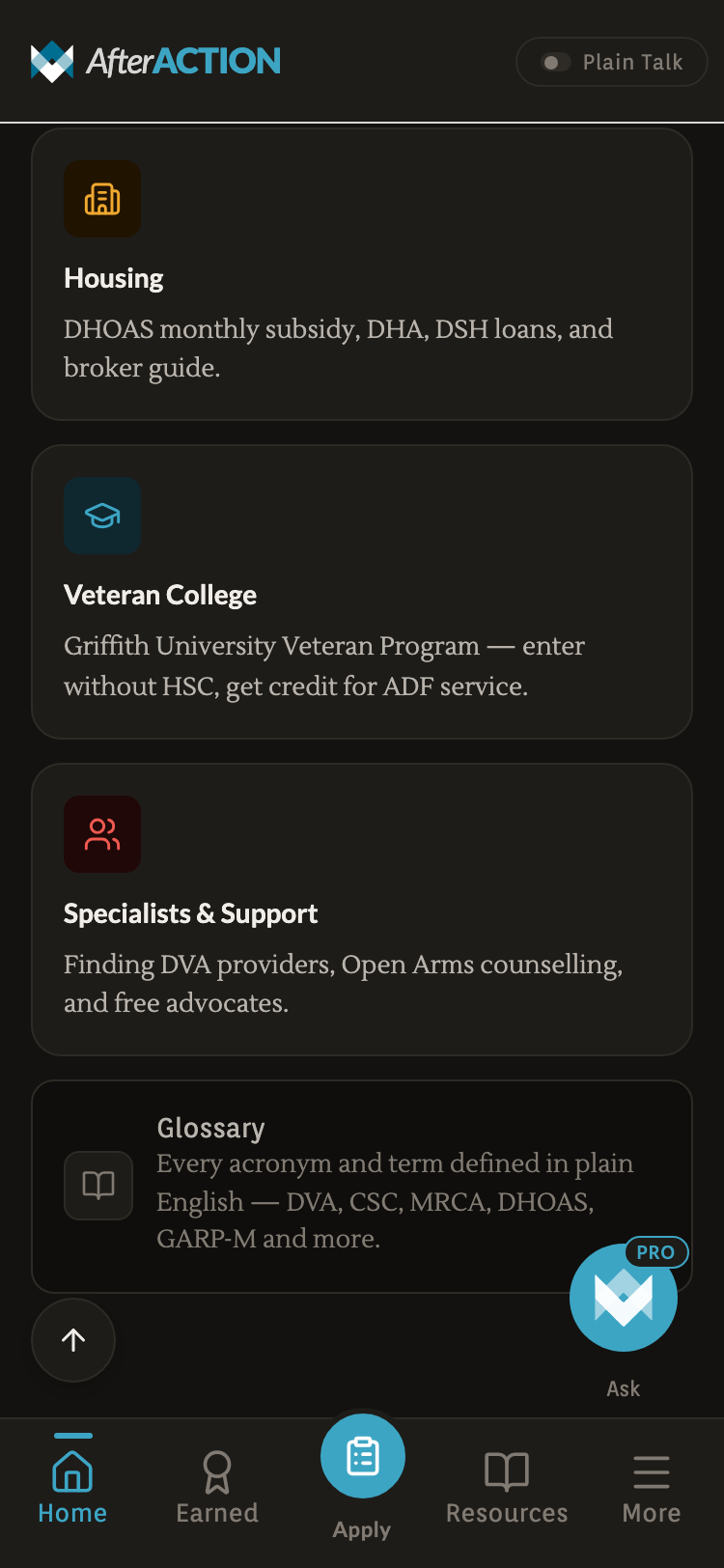
The DVA-native labels.
- 01Benefits
- 02Apply
- 03Housing
- 04Glossary
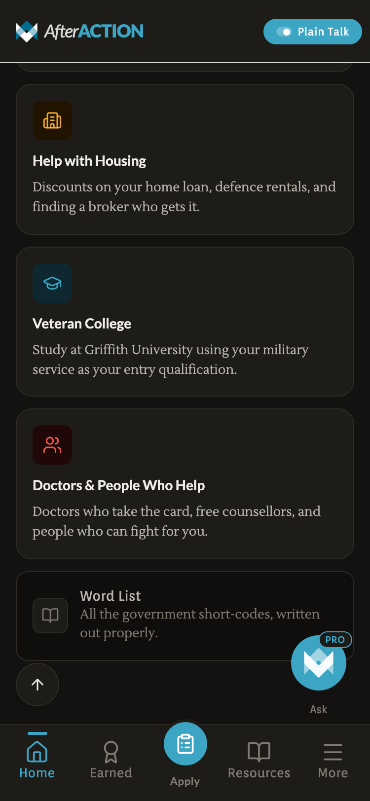
Same content, plainer language.
- 01BenefitsYour Entitlements
- 02ApplyApply for Your Card
- 03HousingHelp with Housing
- 04GlossaryWord List
One disciplined type voice. Two surfaces. Crisis red as the only chromatic exception.
The system is built around a warm near-black dark surface, with a single royal-blue accent and a translucent dark red reserved for Crisis. Every other token is restraint.
/Logomark
The mark is two chevrons brought together. Read one way, they lock into the silhouette of an A : the “After” in After Action. Read the other way, they’re two arrows reaching toward each other: one veteran helping another.
- 01Two chevrons. Cohesion over hierarchy. Neither sits on top of the other.
- 02An “A”, lock-up. The negative space between them holds the letterform without spelling it.
- 03Two arrows, closing. Help moving inward, from veteran to veteran, not top-down from an institution.
/Wordmark
/Colour palette
Page background · dark mode
Accent · icons · primary actions
Primary text on dark
Pressed · depth · gradients
Hover · focus · highlight
Premium signal · Pro · verified
Elevated callouts · wizards
Tiles · sheets · hub cards
18% opacity on Crisis tile
Text on Crisis surfaces
AA contrast verified for every text-on-surface pair. Teal carries action; brass is reserved for premium and verified signals. No pure black (#000) or pure white (#fff) anywhere in the system.
/Typography
Carries the editorial display load with the weight needed for big serif-style headlines. Reads at 11px on a phone, holds up at 11rem on the hero.
A quietly literary feel for body copy. Adds the editorial-magazine note to descriptions and long-form paragraphs.
Sits between Lato and Lustria as the conversational UI voice. Used for buttons, pills, overlines, tab bar.
/Tone of voice
The flows are designed for veterans in distress, not desk-bound users.
No accounts. Ever.
Every byte lives on the device. No login flow, no password reset, no ‘we have sent you an email’. Privacy is a product feature, not a settings page.
Static TypeScript data
Concession rates, hotlines, entitlement descriptions live in committed .ts files. No CMS, no API, no stale-cache problems. Trust comes from auditable source and verified dates.
Verified dates per fact
Every dollar amount, every phone number carries a verified: YYYY-MM-DD field. A quarterly audit script flags anything older than 90 days, fails anything older than 180.
Tap-to-call as a first-class action
Hotline rows are styled as primary CTAs, not list items. Tapping opens tel: directly. The phone is the path of least resistance, not a fallback.
Plain Talk toggle in the header
A global simplify flag lets a user dial complexity up or down without leaving the screen. Toggle state persists.
Stamped progress, never live timers
The Apply hub shows ‘0/7 steps done · 0 documents’: a record of where you are, not a countdown. Veterans don’t need surveillance; they need a logbook.
WCAG AA across every surface. Reduced-motion respected.
Crisis tile pale red (#FECACA) on translucent dark red over ink (#141210) hits 7.8:1. Paper on Ink = 14.2:1. No pure black, no pure white anywhere.
Hotline cards, tile icons, header buttons all clear. Designed for older hands and mid-crisis dexterity, not office hands.
ScalePress, FadeIn, PageSlide, TypeWriter hero all consult useReducedMotion(). Functionality is identical with motion off.
Buttons, links, tabs all labelled. Crisis tile announces ‘In crisis right now, open crisis support’. No div-as-button anywhere.
Focus rings on every focusable element. Tab order matches visual order. Native elements wherever possible.
Apply tab document slots have a print stylesheet so a veteran who wants a paper copy can print and check off.
The product surfaces, in their own visual language.
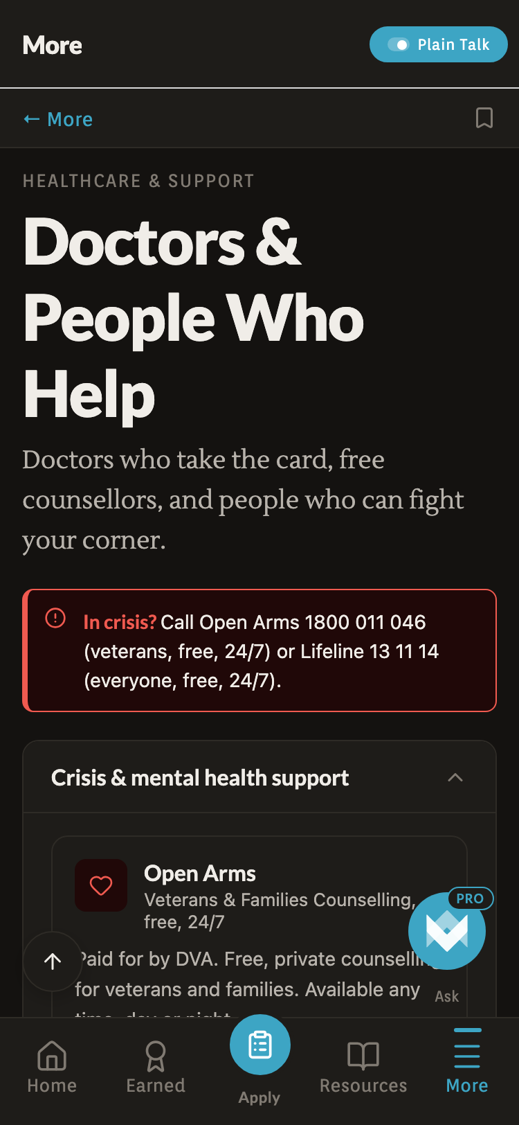
Five hotlines, dialler-ready. Emergency in red, the rest in the app accent. This screen exists so a vet in distress never has to navigate.
Dial the jargon down.
A single pill in the header rewrites every screen in shorter, simpler language. State persists across the app.
Topic hubs.
Hotlines + entitlements + related links per topic. Mental health, Health, Money populated; seven more ‘Coming soon’ stubs.
The dead ends, the kills, the trade-offs in motion.
Finished cases look intentional in retrospect. The reality is messier: here are three concrete decisions made and unmade along the way.
Five calls that shaped the product.
- 01
Crisis tile is a soft red wash, not an alarm.
Originally a saturated #DC2626 fill with white text. It looked like a system error. Replaced with the same red at 18% opacity over the dark surface, with pale red text. The tile now reads as ‘important and ambient’, not ‘something is on fire’.
- 02
No AI free-text on the front door.
Considered a search-first home screen powered by Ask (the AI tier). Killed it. AI misroutes erode trust on the first interaction. Replaced with a 10-tile categorised grid. Ask still exists as a paid tier.
- 03
PathMap moved from a nav card to a bottom sheet.
Originally a separate ‘Path map’ hub card on the Apply tab: a flowchart of the seven steps. Killed it because it duplicated the linear Journey. Re-housed as a bottom-sheet Modal triggered by a small map icon in the StepIndicator pill row.
- 04
Static TypeScript data over a CMS.
A backend CMS would make content edits easier but would introduce uptime risk, sync lag, and a moving target for auditors. Hardcoding hotlines and rates in .ts files means every fact has a git blame and a verified date.
- 05
One screen, then the next. No dashboard.
Resisted the temptation to build a ‘veteran dashboard’ with stats, streaks, completion rings. Veterans aren’t users of a game. The Apply hub shows ‘0/7 steps done’ as a record, not a score.
The product, today.
Counted, not claimed.
The app just launched, so there are no usage metrics to point at yet. What follows are countable facts about the product itself: what it ships with, not what it’s done for anyone.
No signup, no password, no email verification. Open the app and use it. Everything lives on the device.
Emergency 000, Lifeline, Open Arms, Suicide Call Back, 1800RESPECT. All dialler-ready on the Crisis screen.
Crisis lines, every topic hub, search and ten AI questions a month are free forever. The Pro tier is optional.
A linear walk-through from service records to a Gold Card, with per-step document slots stored device-local.
What I’d revisit, what I’d make again.
The Apply tab’s floating 0/7 badge
The badge floats top-right of the Apply hub on desktop. It’s a stat I wanted to surface (‘where you are’) but it sits in empty space, orphaned from the content column. I’d anchor it inside the ‘Where we’re at’ strip or move it into the header bar properly.
Static TypeScript data over a CMS
Every content update is a code commit. Slow if I were optimising for content velocity. But every fact has a git blame, a verified date, and a peer-reviewable diff. For a product where a wrong figure could cost a vulnerable user real money, auditability outranks ease.
The Ask FAB shimmer animation
The AI button shimmers diagonally every six seconds and pulses a subtle halo. It was meant to signal ‘the smart thing’: a soft beacon. In use it reads as ‘the thing the designer was most excited about’. Marked for removal.
A solo project. Made for the people who knew the system from the inside and got tired of pretending it was findable.
Coming soon to the App Store